Archives

Battle of Britain: Mosaic

“I can’t think of a better way to commemorate all those who died, or survived to live through the war!”

Mosaic contributor

Battle of Britain: Mosaic


Putting people in the picture.
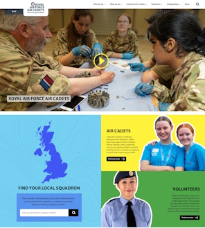
The challenge


How to engage and involve the public in the celebrations for the 75th anniversary of the Battle of Britain?

What we did


We created a crowd-sourced mosaic – where anyone could upload family or other photos to form part of a massive, commemorative image. And there’s a simple search so users can find their picture within the overall image and share it with friends and family.

How it turned out


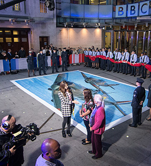
The mosaic was launched on the BBC’s ‘One Show’. It featured on the show again on the anniversary of the end of the battle, when a giant printed version – covering around 32 sqaure metres – was unveiled, live, on air.

moscaic unveiled body insert

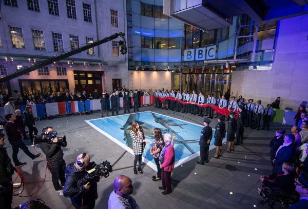
This huge image is now hanging in the RAF museum, where visitors can use a simple app to pinpoint their own picture. Over 15,000 images have been uploaded to-date.

As well as forming a key part of the commemoration and helping to publicise it through users’ social channels the mosaic provided a much-valued opportunity for personal remembrance.

“Thank you so much!  My lovely Mum is there!!!! And in a brilliant position, thank you!  The quality is excellent.  On behalf of my family, we thank you. This is such a brilliant accolade to all those lovely young boys and girls who gave so much!”

“I am so thrilled to have submitted my father’ s photograph and just found it on the spitfire.  The project is absolutely incredible. Will this ever be placed anywhere ( museum) for us to see? Thank you so much for enabling an oldie to do this relatively simply. I am delighted!!”

Mosaic contributors

MRC’s Interactive Career Framework

“The team met all our requirements to the timescale required, without sacrificing on quality”

Simone Bryan, MRC

MRC’s Interactive Career Framework


Bold interaction design with a focus on real people.

The challenge


How to make something as diverse and complex as biomedical research careers really easy to understand, so researchers can make informed career choices?

What we did


Following an ‘agile’ (Lean) UX process of information and interaction design, we worked hand-in-glove with MRC’s Skills and Careers team to visualise, user test and then iteratively develop an Interactive Career Framework. And we brought it to life with real-life case studies, of researchers showing how their own careers developed.

Please also see our case study on the MRC website revamp.

How it turned out


The ICF performed well in our post-launch site survey (for instance, for ‘overall user experience’, 87.3% of users gave it 3 – 5 stars out of 5, with 17.5% giving the maximum of 5 out of 5. n=126).

And its launch had a big impact on the MRC’s twitter profile – spot the launch date:

Twitter pic for ICF 1 - y axis data removed

Building bridges across UK research

Having launched the career framework, we worked with these eight UK research funders to incorporate all of their funding schemes into a new ‘funding view’:

In the process, led by MRC, we created a common language and frame-of-reference for UK research funding, all for the very first time.

It was an object lesson in bringing stakeholders together, forging agreement by sharing with them the findings from our user research.

“We’ve received lots of feedback from users via Twitter about how useful the map is. This was a very complex piece of work and the team met all our requirements to the timescale required, without sacrificing on quality.”

Simone Bryan, MRC

Barnardo’s Centre of expertise on CSA

“Their strength is in really seeking to understand what we are trying to achieve and doing what they can to contribute. They feel very much part of our team”

Cassi Harrison (Barnardo’s / CSA Centre)

Barnardo’s Centre of expertise on CSA


Helping an important new Centre of expertise on Child Sexual Abuse (CSA) come into being, creating a model for future Centres of expertise.

The challenge


Who are the principal users for this new Centre of expertise? And what do they need most? Vital questions for us to answer in developing their website. Also of great value for the new Centre as it geared up and came into being.

In the beginning

This brand new ‘Centre of expertise’ was created by Barnardo’s with Home Office funding.

The organisation existed only in name when we partnered with Lagom Strategy to help the Centre realise their vision.

The goal was to create a website to engage with their core users; CSA professionals across multiple sectors (policy makers, schools, hospitals, police, etc).

But for this new style of Centre it wasn’t clear who the principal users would be, or what were their most pressing needs.

What we did


Researching the Centre

At a kick-off meeting with Centre staff we worked out who we thought our key users would be – and what their needs were. We then interviewed more than two dozen potential users by phone, to get a better understanding of what the Centre could do for them – and what others were already offering.

These interviews were supported by a user needs workshop. Four small groups of users and Centre staff worked to create typical user personas and look at their needs.

And to validate the list of user needs and quantify which ones to prioritise an online survey was created. The Centre promoted this to all their contacts and we got 341 detailed responses – a terrific result, and testament to the interest in the Centre’s work.

Next, user needs were mapped by importance, and broken down by role. And based on these results we prototyped simple versions of the website – as Bruce Hannah said: “Mock it up before you fock it up.” – and we then research tested them with users.

We already knew that the Centre’s research – the key website content – would be the star and that technology should play a best-supporting role. What else did we learn?

Key users were not who we all thought, and their needs also differed to what we envisaged. In response we prototyped new ways to present the Centre’s work and revisited everything from how references are cited to how charts and figures are presented, working with the Centre as one agile team. We also helped create an online Directory of services, in response to user demand.

Up and online in two weeks

Also at the outset, we created an MVP (Minimum Viable Product) website in two weeks, to lay the ground for the emergent Alpha and Beta sites, and to respond to the hunger for information.

The outcome


The ‘Live Beta’ website is regarded as a model for future Centres of expertise:

“The team at Binary Vision has enabled us to take a more coordinated and strategic approach. Alongside delivering the technical side of things they have helped us to embed greater consistency of approach e.g. through working with us on style and brand, content structure and building standards into our procurement process.”

“Their strength is in really seeking to understand what we are trying to achieve and doing what they can to contribute. They feel very much part of our team, as opposed to a traditional commissioner/provider relationship and consistently go above and beyond, for example by feeding us interesting, thought-provoking and practical ideas.”

Cassi Harrison, Director, Centre of expertise in CSA (Barnardo’s)

Childcare Choices

“I’m now back from leave and basking in the glory reflected from you all. Good job on a successful launch”

Andy Heath, HMRC

Childcare Choices


Balancing the needs of parents and four government departments

The challenge


To create, at speed, a campaign site – Childcare Choices – to bring together all eight of the government’s childcare support offerings, in a way that clicks with parents.

What we did


Working to a tough deadline, we created a fully-functional MVP (Minimum Viable Product), ready for launch in under four weeks.

Our concept was to create an interactive web app, which would bring together all of the governments’ childcare support schemes in a really engaging way, prioritising these for parents according to their circumstances.

And users can quickly explore how the available support might change as their circumstances do. For instance “what would happen if we were both working?”. This proved really popular with parents looking to weigh up their options and plan ahead.

Inclusive user research

We designed our user research to mimic core use cases, notably parents with young children. This had some pretty wonderful consequences when we ran research sessions in our UX lab at BV:

We also reached out to (often-forgotten) core users, for instance visiting low-income single mothers in their homes, and doing our research with them using their own devices (and with their children providing suitable distraction).

This enabled us to fashion a truly user-centred web app. For example, we paid particular attention to ease-of-use on small tablets as we found these were prevalent in this hard-to-reach user group.

Taking four departments of state with us all the way

To get to MVP on time, we ran four week-long sprints – with weekly show-and-tells across all four departments to ensure they were all engaged and involved throughout. These were attended by upwards of 20 people across the departments (HMRC – lead client, DfE, Treasury, DWP).

In these show-and-tells we shared the latest prototyping / coding, reported on the sprint’s user research findings, recommended priorities and discussed the direction of travel for the up-coming sprint.

At the end of the four weeks, we presented our working MVP to the Directors of Communications for all four departments and took on board their input.

Following that, up until ministerial launch, we ran a series of two-week sprints and iterations – honing the usability.

Iterating usability: a working example

As part of our observational research, we found that many users didn’t notice which schemes we’d highlighted for them, based on the information they gave us.

So we added a really clear system of icons with a sticky (always visible) legend at the top of the page. Subsequent research showed this solution was highly effective, with all users seeing and comprehending which schemes were highlighted for their attention.

How it turned out


The site rapidly exceeded all key performance indicators and we reached one million users – our target for the first year – after just 4 months.

Latest update!

Since going live, research revealed that users love how information on this site is personalised for them – and they told us they wanted more. So we created a simple-to-use feature where parents add in brief info on their children and see instant, targeted information for each child, for instance on application dates for the various funding options.

“We’re getting lots of lovely feedback about your site – and I think it looks great. This is a really important milestone, and it’s a great example of a cross-Department product designed for and with parents.”

Rachel Hope, HMRC

Royal Air Force

I would highly recommend Binary Vision as a technical, creative and innovative agency. They are amazing to work with.”

Sq. Ldr. Tim Barlow MBE, RAF

Royal Air Force


Binary Vision conceived and then delivered a new digital vision for the Royal Air Force, focusing on real RAF people and their stories, to project the service’s unique character and importance – to audiences new and old.

The challenge


The challenge was immense with a bloated web estate (10,000 pages, 100+ websites) running on old technology. There was a lack of digital strategy, governance or any real focus on users.

What we did (some highlights)


Binary Vision assembled and then led a world-class digital partnership of three top UK agencies (with Lagom Strategy for UX, Helpful Digital for engagement). And with a new RAF digital team at the helm, we:

  • Designed and created a modern, user-focused RAF website which the service can be proud of, and is.
  • Articulated, for the very first time, why we need the RAF – distilling this into six digital themes.
  • Created a series of high-fidelity feature stories, breathing life into these digital themes (e.g. this Irma relief feature as an exemplar of Delivering Aid).
  • Created a strategy for championing and supporting social media ‘storytellers’ from across the RAF. And by putting real RAF people (in all their diversity) at the heart of what we do, we gave the service’s digital communications an authentic and relatable voice.
  • Captured new audiences, for instance with a section dedicated to ‘STEM’ learning for young adults
  • Conceived and delivered bold and innovative web features, in response to research-led user need, such as 3D aircraft recognition, and interactive Red Arrows manoeuvres.

All of this was possible because we also:

  • Engaged with stakeholders across the organisation to make the transition to a new unified website painless and seamless
  • Created sub-sites for dozens of RAF organisations with a distributed publishing model (for instance stations can edit and update their own sub-sites).
  • Built a comprehensive content model to ensure elements (e.g. stations, squadrons, aircraft…) automatically cross-link as appropriate
  • Delivered the website on a robust, secure platform with an easy-to-use (free and open source) content management system.
  • Trained dozens of RAF staff in using the CMS.
  • Turned off over 100 legacy sites.

How it turned out: quick starts


How it turned out: quick stats

  • Latest website survey: 80% satisfied or very satisfied, 89% found what they wanted
  • 10,000 pages consolidated into a unified new website of under 1,000 pages
  • Mobile usage up from 13.5% to 44%
  • Cross-channel digital campaigns eg. launch of 3D aircraft recognition saw traffic up 400+%

One team


This is a great example of the oft-quoted ideal of ‘One team’ Agile delivery:

  • Worked in user-led Agile (Kanban) sprints, ‘in the open’ so our client could help shape progress; RAF Air Media and Comms (with their users, stakeholders) are a crucial part of the delivery team
  • We introduced agile to the RAF, and vice versa, with knowledge exchanged in all directions
  • Passed all three (Alpha, Beta and Go live) GDS assessments, run by MOD first time, avoiding delay / extra cost

“The RAF website is our front page on the internet, and more than ever we needed to stand out. So, we had to ensure when relaunching the site we had a digital agency we could rely on. Binary vision went above and beyond when it came to this task and exceeded expectations.When working in digital you need the expertise at hand to achieve such a momentous task. Along with technical experts we needed to ensure our website was innovative, creative and original. Binary Vision’s team is an accumulation of high-class professionals you can trust, the diverse skillset they have to hand is incredible and reliable.

A few examples of their inventive thinking have resulted in some pioneering aspects to our organisation’s website; such as 3D Models of our Aircraft – which includes animation, dynamic elements and content tailored for our targeted users. We wanted to prioritise the user experience and user interface to tell the story of what the RAF does, ensuring the user can find what they need easily. Binary Vision understands this and is passionate about creating these experiences for our users.

They were very supportive with what we needed and were able to assist us in differentiating between what we want and what we need to succeed. The user research conducted is very important and every time since the initial phase we have learned something new, giving us ideas to develop the site further.

I would highly recommend Binary Vision as a technical, creative and innovative agency who are extremely supportive and understanding. They are amazing to work with and are exceptional when it comes to maintaining relationships and developing new ideas.”

Squadron Leader Tim Barlow MBE, Royal Air Force

Oxford Instruments

Working with Binary Vision is just so easy, they bring such great ideas to the table and then exceed my expectations in delivering them”

Dean Bass,  Oxford Instruments NanoAnalysis

Oxford Instruments


Binary Vision is transforming the experience of Industrial IoT and connected devices.

Working with Oxford Instruments NanoAnalysis we revealed the hidden value in their connected systems.  We created an innovative web app to turn complex data into practical and useful insights. In the process, we created new revenue opportunities, as well as wider, deeper customer engagement.

The challenge


Oxford Instruments make state-of-the-art electron microscope detectors used in labs around the world. They send back a mass of data but it wasn’t being displayed in a way that was valuable to people. As a result, there was limited uptake among both customers and OI staff for their IoT system.

“We had all this valuable data”, says Dean Bass, Product Development Director at Oxford Instruments NanoAnalysis, “but it wasn’t actually useful to anyone. It was data without intelligence”.

The goal


Create a powerful, intuitive web app which presents this complex data in ways that are useful to users, allowing support staff to spot problems, and sales teams to demonstrate added value to customers. An app designed for easy adaptation so OI’s customers will be able to interact with the data from their microscope detectors.

What we did


  • Customer and user research to identify priorities, gradually refining user needs with each ‘iteration’ (update)
  • Worked to understand the complex data the systems were transmitting, and how they could be made useful to both customers and the business
  • Used an agile approach to designing and building the web app, with cycles of development and improvement, guided by testing and research, to build out what works best
  • Produced a ‘progressive’ web app (use it as a website or download it as an app) including a global overview dashboard, and an innovative interactive ‘tree’ of each connected system.

How we overcame problems


On the way, we met a series of blockers – with data completeness and consistency, for instance – but our Agile approach meant we could work with our client to find ways around them.

How it turned out


“Everyone loves it!”, says Bass. SENTINEL viewpoint is a user-friendly web app that’s optimised for phone, tablet and PC.

Sales teams are having new conversations with customers, and service teams can respond to alerts and examine systems remotely, even predicting problems before they happen.

Why Binary Vision?


“Binary Vision know this space,” says Dean Bass. “They have a process that allows them to home in on what users need. They also have enough technical knowledge to talk to specialist users in fields like instrumentation, then work with the available data to deliver against them.”

“Anyone with an IoT solution has vast amounts of connected data coming off sensors and into databases. They need simple dashboards which offer valuable insights, communicated clearly. And they need a partner that can deliver this.”

Tempest Interactive

“I came to you with a big ask and a short timeframe and we are very happy with how everything has turned out.”

Kirsten Berry, Team Tempest

Tempest interactive


How BV delivered a high-impact 3D explorer – of future combat air systems – in less than five weeks, getting our client more hits in two days than across the entire previous year.

Team Tempest

Team Tempest is delivering the future capability of the UK’s air and space defence including a next generation fighter aircraft. The programme embraces a novel, agile delivery model, working closely with major industry partners such as Rolls Royce and BAe Systems. That made for a great fit with Binary Vision, as agility and partnering are central to everything we do.

What happened

Binary Vision was putting the finishing touches to our Tempest virtual reality installation, designed to create a buzz around science and engineering careers for young people. The VR experience was due to launch at the 2020 Royal International Air Tattoo (RIAT). But due to the pandemic, the live event was cancelled and with just five weeks to go, a virtual RIAT was announced.

The challenge


Could BV create something really impactful and engaging for virtual RIAT, to highlight Tempest’s achievements and vision, and keep the programme firmly in the public eye?

What we did


Binary Vision has the ability and agility to respond to changing times – switching track at speed, while never compromising on quality.

We created a novel interactive 3D explainer where users can explore future air defence systems, capturing the excitement of the Tempest programme.

We combined specialised design and coding talents from video gaming with our front-end web experts to create a stunning interactive 3D explorer.

Key to delivering all of this on time (and on budget) for virtual RIAT, in a matter of weeks, was liaising closely with all four Tempest industry partners – BAe Systems, MBDA, Leonardo and Rolls Royce – to ensure that they were just as happy with what we created as Tempest HQ.

How it turned out


The new Tempest zone and interactive explainer were really well received by our client, Tempest partners and above all by site users. The 3D explainer was a focus of interest at virtual RIAT.

And the stats support that; the Tempest presence on the RAF website received more views that weekend than over the entire previous year. And it remains a lasting online legacy, with on-going high levels of traffic and sustained interest in the programme.

Why Binary Vision?


Who else could pull it off? Binary Vision has a unique blend of creativity, customer focus and technical skill to deliver such complex digital interaction in a matter of weeks, and in a way that really clicks with users.

“I came to you with a big ask and a short timeframe and we are very happy with how everything has turned out.” Kirsten Berry, Team Tempest

RAF Cadets site

“It’s been fantastic to work with them through user research to delivery. ”

Jarrod Williams, RAF Cadets

RAF Cadets site


Binary Vision worked with the RAF Cadets team to re-design and modernise their website. We also designed and implemented an effective, and user-friendly way for website visitors to navigate between the main RAF website and the RAF Cadets website, bringing the two together without losing the distinctive feel of the Cadets site. The Cadets site is hugely important for the RAF as an engagement tool.

The challenge


The RAF website and the RAF Cadets webpages have historically been managed as two completely separate sites. The Cadets website hadn’t been refreshed for a number of years and needed a new look and feel, along with new content to ensure it was doing the best job possible to engage young people and adult volunteers.

We were asked to look at the best way of bringing the sites together as a family so that they all felt like part of the RAF but importantly, the Cadets site still looked and felt like its own distinct area, and appealed to both a younger audience and adult volunteers.

What we did


As part of the project we worked on updating the look and feel of the Cadets site, and helped to refresh outdated content. The aim for the Cadets site was that it had a more modern feel, appealed more to young people, as well as an older audience of volunteers, was easier to read, and had improved accessibility.

Before website re-design

After website re-design

We explored a range of options for taking people to and from the main RAF site to the Cadets site:

  • One option was to add the Cadets link to a navigation menu but we felt that might be easily missed and confusing, and you wouldn’t always realise you were moving from one site to another. This isn’t something we’d recommend as a good design pattern
  • Another possibility was a button next to the existing Join the RAF button, however, that felt like people were being redirected to a completely separate site and would be leaving the RAF site. It would also have been confusing to have a Join the Cadets button next to a Join the RAF button
  • We explored a tab in the navigation bar which was the chosen option

Once we had mocked up and reviewed the preferred option, our partners Lagom Strategy carried out user research. They engaged with both current and prospective cadets and adult volunteers, using both laptop and mobile devices. In these sessions users were asked to look at and share thoughts on a series of designs for the new website. We looked at designs for navigating the new site, the squadron finder and joining forms, and content pages on cadet activities and being a volunteer. The findings were shared with the project team on a Miro board, and a session was held prioritising who was best placed to action the feedback received from users.

Further user research will take place now that the new site is live. This will again take place remotely and explore how the site is being received in general as well as testing specific parts of the website identified as needing further attention.

The Before and After


Jarrod Williams of the RAF Cadets said of Binary Vision and Lagom: “it’s been fantastic to work with them through user research to delivery. Seeing the word ‘cadets’ next to the RAF logo on their site really demonstrates the Whole Force approach, and the bond the Air Cadets have with it’s parent force.”