

“I’m now back from leave and basking in the glory reflected from you all. Good job on a successful launch”
Andy Heath, HMRC
Childcare Choices
Balancing the needs of parents and four government departments
The challenge
To create, at speed, a campaign site – Childcare Choices – to bring together all eight of the government’s childcare support offerings, in a way that clicks with parents.
What we did
Working to a tough deadline, we created a fully-functional MVP (Minimum Viable Product), ready for launch in under four weeks.
Our concept was to create an interactive web app, which would bring together all of the governments’ childcare support schemes in a really engaging way, prioritising these for parents according to their circumstances.
And users can quickly explore how the available support might change as their circumstances do. For instance “what would happen if we were both working?”. This proved really popular with parents looking to weigh up their options and plan ahead.
Inclusive user research
We designed our user research to mimic core use cases, notably parents with young children. This had some pretty wonderful consequences when we ran research sessions in our UX lab at BV:
We also reached out to (often-forgotten) core users, for instance visiting low-income single mothers in their homes, and doing our research with them using their own devices (and with their children providing suitable distraction).
This enabled us to fashion a truly user-centred web app. For example, we paid particular attention to ease-of-use on small tablets as we found these were prevalent in this hard-to-reach user group.
Taking four departments of state with us all the way
To get to MVP on time, we ran four week-long sprints – with weekly show-and-tells across all four departments to ensure they were all engaged and involved throughout. These were attended by upwards of 20 people across the departments (HMRC – lead client, DfE, Treasury, DWP).
In these show-and-tells we shared the latest prototyping / coding, reported on the sprint’s user research findings, recommended priorities and discussed the direction of travel for the up-coming sprint.
At the end of the four weeks, we presented our working MVP to the Directors of Communications for all four departments and took on board their input.
Following that, up until ministerial launch, we ran a series of two-week sprints and iterations – honing the usability.
Iterating usability: a working example
As part of our observational research, we found that many users didn’t notice which schemes we’d highlighted for them, based on the information they gave us.
So we added a really clear system of icons with a sticky (always visible) legend at the top of the page. Subsequent research showed this solution was highly effective, with all users seeing and comprehending which schemes were highlighted for their attention.
How it turned out
The site rapidly exceeded all key performance indicators and we reached one million users – our target for the first year – after just 4 months.
Latest update!
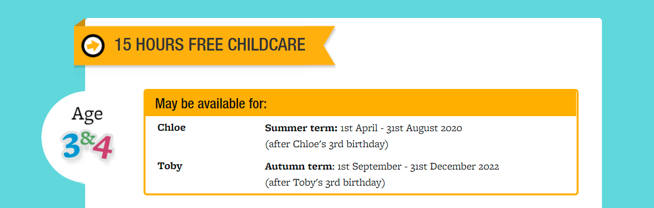
Since going live, research revealed that users love how information on this site is personalised for them – and they told us they wanted more. So we created a simple-to-use feature where parents add in brief info on their children and see instant, targeted information for each child, for instance on application dates for the various funding options.
“We’re getting lots of lovely feedback about your site – and I think it looks great. This is a really important milestone, and it’s a great example of a cross-Department product designed for and with parents.”